Exploring outputs
This section explores the various outputs of the code.
While only .png files are referenced below, the code will output three versions of each figure:
- .fig - this version is for ease of editability within Matlab
- .png - this version is made for sharing
- .tif - this is a high resolution version for presentations and publications
Of note, there are slight differences in the outputs based on your choice of input (functional connectivity or cortical thickness).
- The beta-weights for functional connectivity data are a summation of the absolute values. For cortical thickness, the beta-weights are not summed.
- Given that cortical thickness data does not entail network-network interactions, all of the network figures (and related subfolders) discussed below do not apply.
BWAS Outputs
- tables
- figures
- weights_explainedvariance
- scatter_plots
- by_networks
- relativecontributions_plots
- pvalues_explainedvariance
- manhattan_plots
- ciftis
PNRS Outputs
- tables
- weights_explainedvariance
- figures
- weights_explainedvariance
- scores
- scatter_plots
- by_top_connection
- by_networks
- pvalues_explainedvariance_2_samples
- pvalues_explainedvariance
- explainedvariance_and_null
BWAS Tables
These outputted tables provide summary statistics from the calculation of the $\beta$-weights in the training sample. The following tables are included:
- Rsquared.csv
- brain_feature.csv
- correlations_by_networks.csv
- mapping_brain_feature_index_2_ROIs.csv
- scores_by_networks.csv
BWAS Figures
These outputted figures are visualizations of the calculated $\beta$-weights in the training sample.
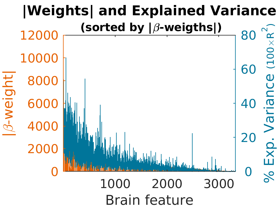
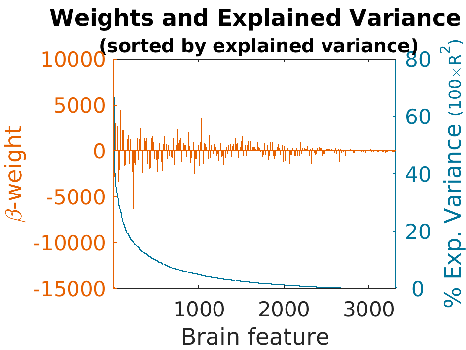
BWAS: Weights by Explained Variance
These figures rank the $\beta$-weights and the corresponding explained variance within the training sample by different parameters. They can be ranked by brain feature, by weight, or by their explained variance. Two versions of each parameter are provided - one with the actual $\beta$-weight values and one with the absolute values of the $\beta$-weights. The following figures can be found in this folder:
- AbsWeights_explainedVariance_by_Weight.png
- AbsWeights_explainedVariance_by_brainFeature.png
- AbsWeights_explainedVariance_by_explainedvariance.png
- Weights_explainedVariance_by_Weight.png
- Weights_explainedVariance_by_brainFeature.png
- Weights_explainedVariance_by_explainedvariance.png
Here is an example figure:
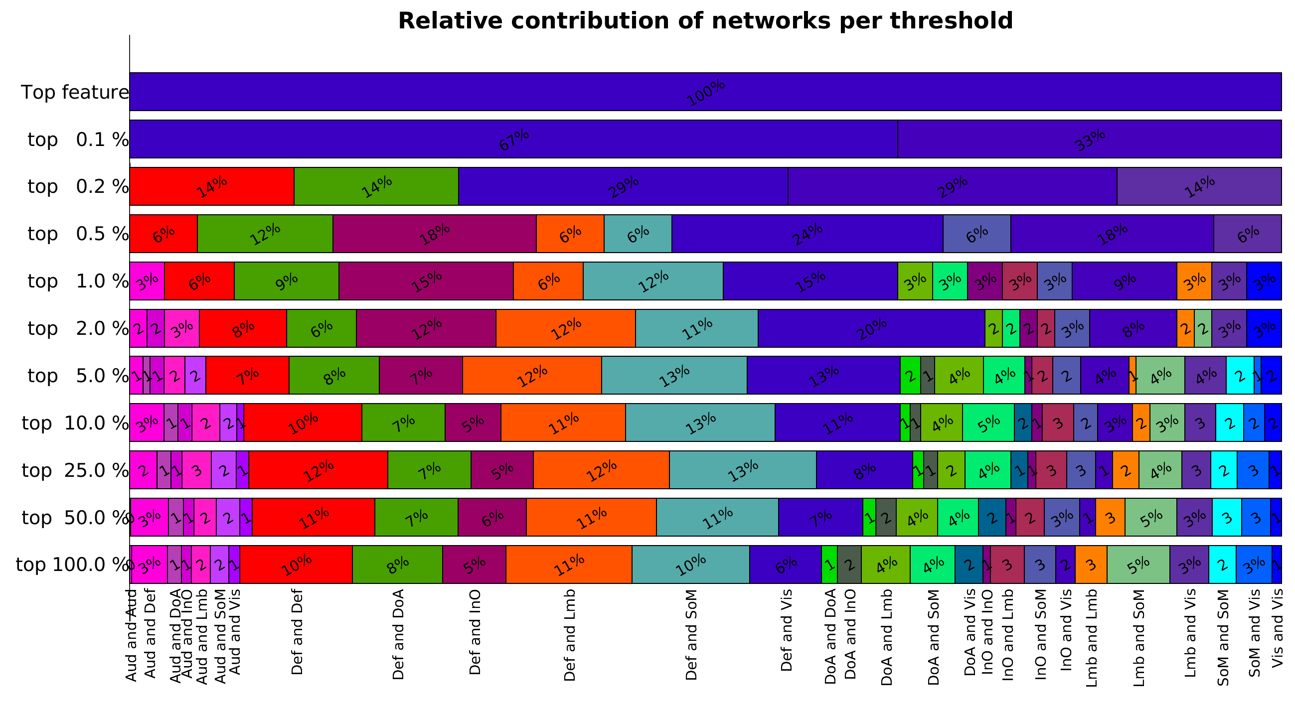
BWAS: Relative Contribution Plots
These figures show the network assignment of the $\beta$-weights that are included at each imposed threshold. These plots show the stability of each network's representation across the thresholds assessed. Two versions are included in the folder:
- Relative_networks_contribution.png
- Relative_networks_contribution_truncated.png
Here is an example figure:
BWAS: P-values by Explained Variance
These figures show the p-values of each $\beta$-weight and the amount of variance each $\beta$-weight explains within the training sample. Two versions are included in the folder:
- pValue_Variance_by_brainFeature.png
- logpValue_Variance_by_brainFeature.png
Here is an example figure:

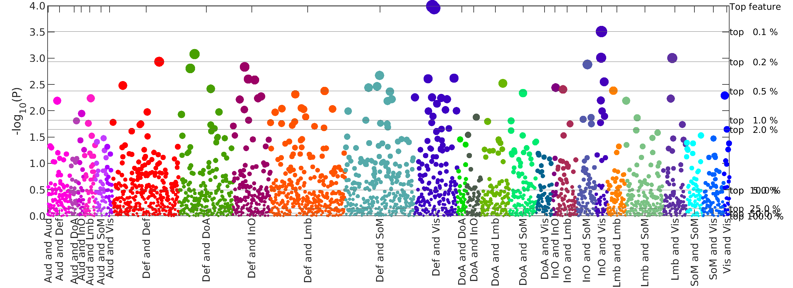
BWAS: Manhattan Plots
These figures, commonly used in the field of genetics, rank the $\beta$-weights by their log P values. The $\beta$-weights are color-coded based on network pair assignment and the horizontal lines represent the imposed thresholds. This allows us to visualize which network pairs contribute connections at each threshold. The folder contains the following versions of the figures:
- BWAS_manhattan_plot_like.png
- contains all of the network pairs
- BWAS_manhattan_plot_covering_less_than_1_percent.png
- contains only networks with less than 1% of total brain connections
- BWAS_manhattan_plot_covering_more_than_1_percent.png
- contains only networks with more than 1% of total brain connections
- BWAS_manhattan_plot_truncated.png
- represents the less than 1% networks as one unit
Here is an example figure:
BWAS Ciftis
To visualize the $\beta$-weights on a brain, you can use the CIFTI files. There are files to show the $\beta$-weights at the different thresholds used in the analyses. There are also files for each brain network (CT) or network pair (fconn).
- When the input is cortical thickness, the $\beta$-weights are shown directly on the brain.
- When the input is functional connectivity, the summation of the absvalue of the $\beta$-weights are visualized on the cortical surface.
PNRS Tables
These outputted tables provide summary statistics from the calculation of the PolyNeuro Risk Scores (PNRS) in the test sample. The following tables are included:
- Rsquared.csv
- scores_by_networks_cummulative_reversed.csv
- scores_by_networks_cummulative.csv
- scores_by_networks.csv
- scores.csv
- correlations_by_networks_plus_cummulative_reversed.csv
- correlations_by_networks_plus_cummulative.csv
- correlations_by_networks.csv
- correlations.csv
PNRS Figures
PNRS: Weights and Explained Variance
These figures rank the $\beta$-weights and the corresponding explained variance with in the test sample by different parameters. They can be ranked by brain feature, by weight, or by their explained variance. Two versions of each parameter are provided - one with the actual $\beta$-weight values and one with the absolute values of the $\beta$-weights. The following figures can be found in this folder:
- AbsWeights_explainedVariance_by_Weight.png
- AbsWeights_explainedVariance_by_brainFeature.png
- AbsWeights_explainedVariance_by_explainedVariance.png
- Weights_explainedVariance_by_Weight.png
- Weights_explainedVariance_by_brainFeature.png
- Weights_explainedVariance_by_explainedVariance.png
Here is an example figure:
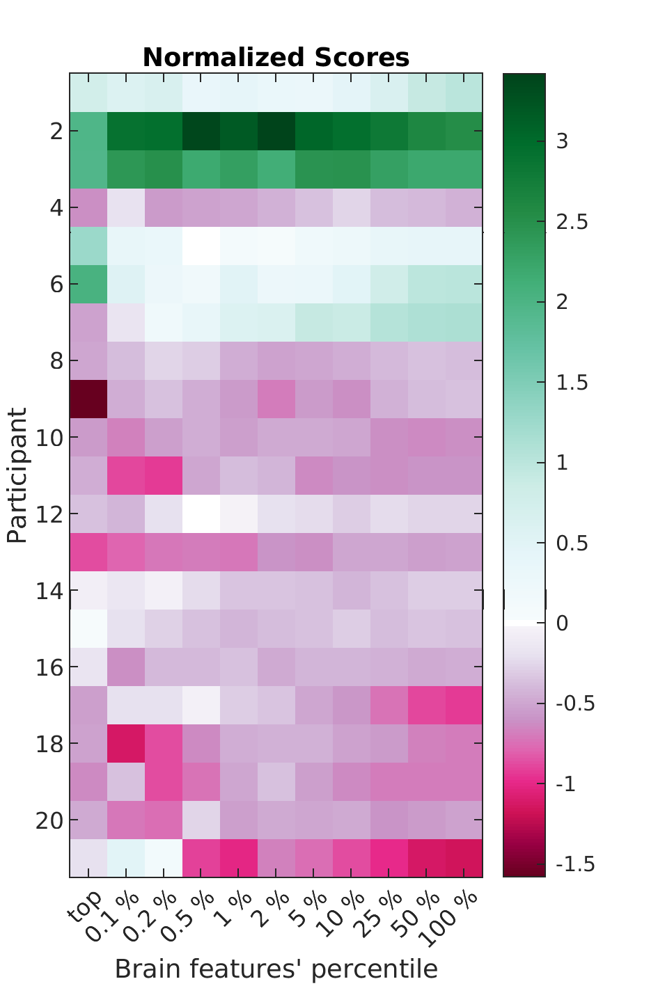
PNRS: Scores
These figures visualize the calculated PolyNeuro Risk Scores for each participant at the various thresholds. Scores calculated by network pairs are also included.
Here is an example figure:
PNRS: Scatter Plots
These figures compare the calculated PNRS to the independently calculated score for the outcome of interest within the test sample (the same variable used to calculate the $\beta$-weights in the training sample). There are three types of plots generated:
- scatter: this is a basic scatterplot where each dot represents a participant
- dscatter: this plot includes "level curves" indicating the density of the data cased on a bivariate distribution. Each dot (participant) is colorcoded based on the density level.
- gscatter: this plot colorcodes each dot (participant) by group, as defined in the optional input argument Group_Color_Table
Here is an example figure:

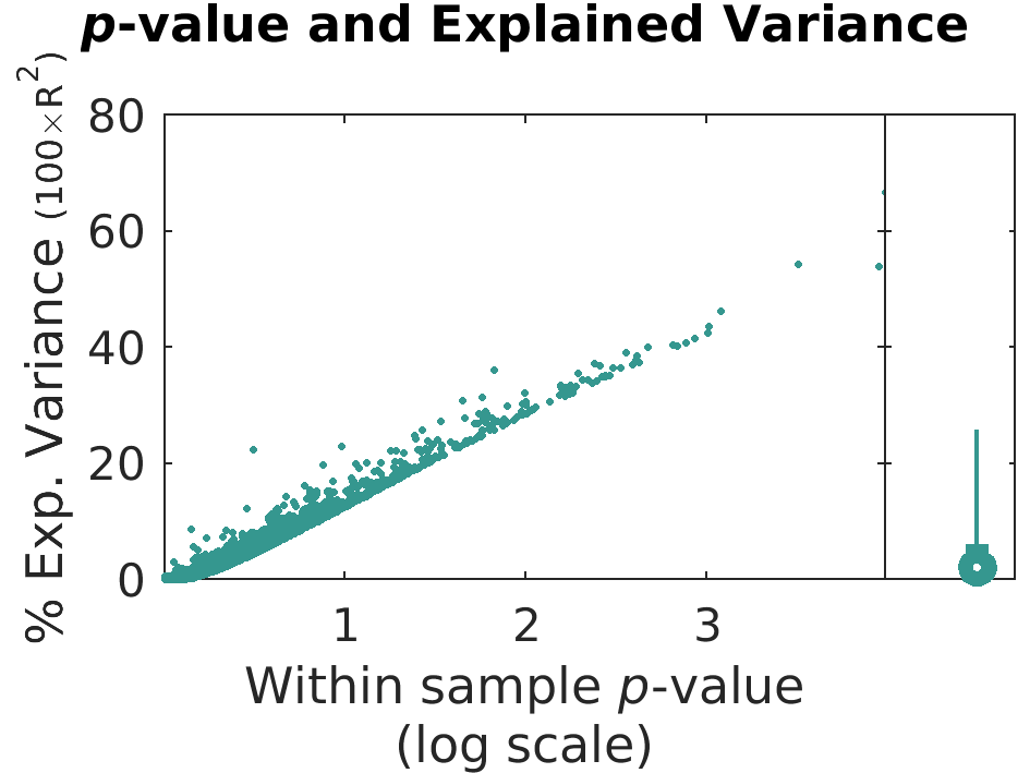
PNRS: pValues and Explained Variance
These figures show the p-values of each $\beta$-weight and the amount of variance each $\beta$-weight explains in the test sample. Two versions are included in the folder:
- pValue_Variance_by_brainFeature.png
- logpValue_Variance_by_brainFeature.png
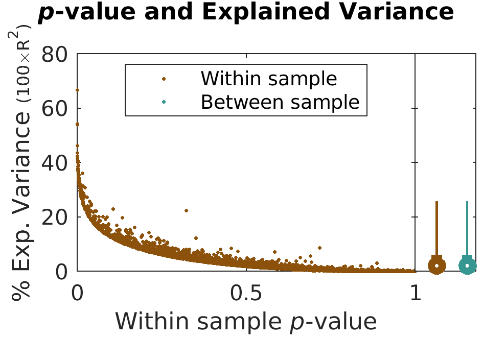
PNRS: pValues and Explained Variance - 2 Samples
This figure combines the two previously explained pValues and Explained Variance plots. Therefore, it shows both within sample and between sample percentages of explained variances for the $\beta$-weights. Two versions are included in the folder:
- pValue_Variance_by_brainFeature.png
- logpValue_Variance_by_brainFeature.png
Here is an example figure:
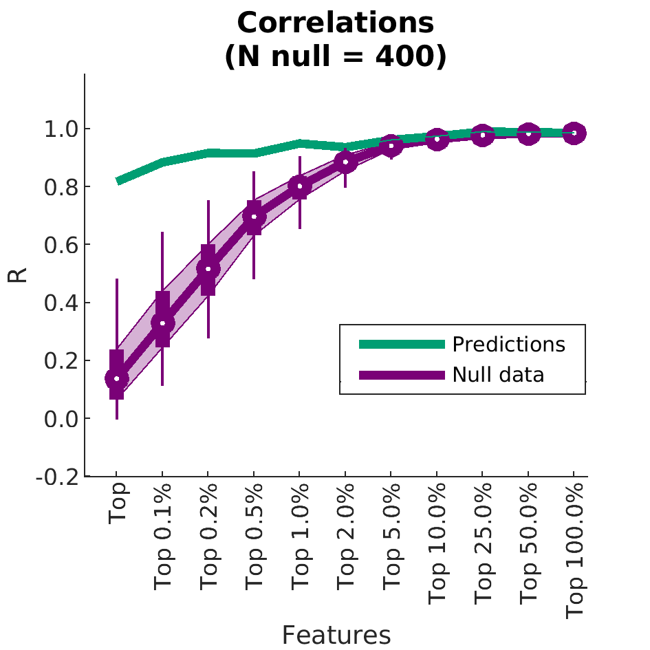
PNRS: Explained Variance and Null
These figures show the R value or percentage of explained variance based on the connections identified at each threshold. Null data is generated by randomly selecting the same number of connections 400 times. The outputs from each of those trials is reported in purple. These results are also available by network. The following figures are included in the folder.
- Correlations_N_11.png
- Correlationsbynetworks_N_15.png
- Correlationsbynetworks_N_28.png
- Correlationsbynetworks_Negcorr__N_15.png
- Correlationsbynetworks_Negcorr__N_28.png
- ExplainedVariance_N_11.png
- ExplainedVariancebynetworks_N_15.png
- ExplainedVariancebynetworks_N_28.png
- ExplainedVariancebynetworks_Negcorr__N_15.png
- ExplainedVariancebynetworks_Negcorr__N_28.png
Here is an example figure: